
Een tijdperk van 'flat design'
Was de wereld klaar voor iOS7?
A decade of 'flat design'
Was the world ready for iOS7?
While browsing Mastodon, I stumbled upon this anniversary:
An anniversary, not a jubilee. Unfortunately, it's not 10 years of iOS7. More like 10 years and 366 days. But I didn't have this blog on Sept. 18 2023, so here we are.
Back in 2013, I already had a strong interest in interface design. With that release, I learned just how opinionated people could be about UI.
Case in point: just opening the first comments on BasicAppleGuy's post shows how divisive that update was:
'A very sad day in history.'
'A sad downgrade of design.'
'That was the OS that really pulled me in to software!'
'That was a huge step in iOS design – in a positive way. Looking back everything prior looks just plain old.'
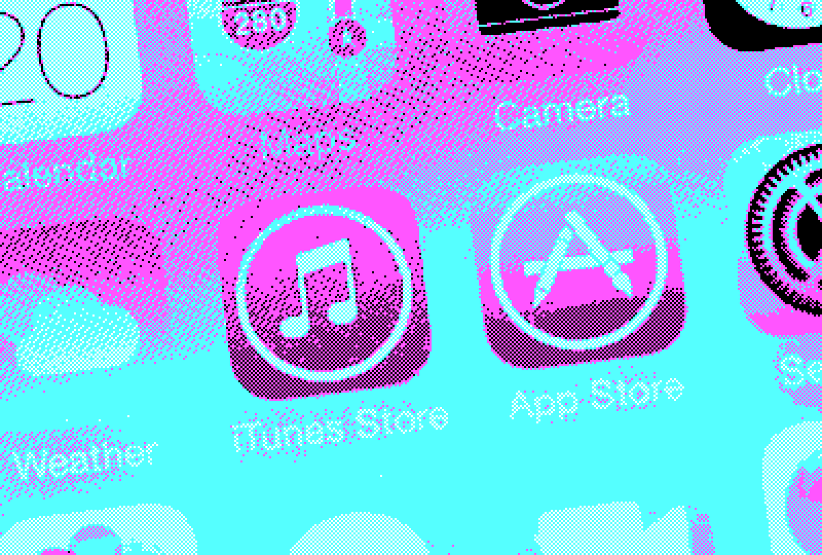
Granted, it was quite the turning point. Up till that point, iOS had a very distinctive visual design. It had a name that would score you a lot of points in designer Scrabble: skeuomorphism, where interface objects mimic their real-world counterparts.
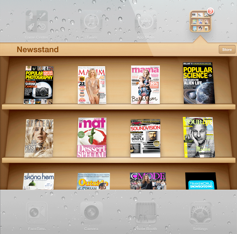
The Mastodon-post has some great examples. Here's another example, to show how far Apple pushed this: this is an actual magazine stand, with depth, and photorealistic magazine covers.
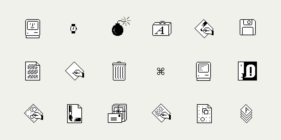
Just like Susan Kare and the Macintosh team had realized 30 years earlier, when designing the first graphical operating system: people need metaphors to get used to new behaviors.
By 2013, Apple judged, people had built up this familiarity. So it switched on the iron, and flattened ... everything.
I remember feeling quite mixed by it myself:
'Affordance' took a hit. Buttons were replaced by subtle text links. (Apple eventually iterated on this, as this was a usability faux-pas.)
It was the most clear-cut example of 'less is more'.
To elaborate that final point: iOS7 make me appreciate sparsity. And I still remember what exactly made that click:
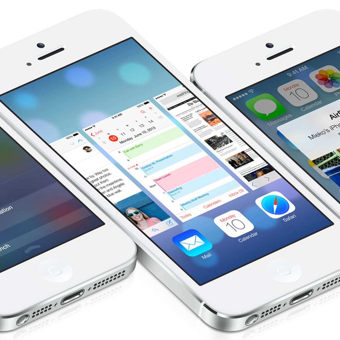
- The release also introduced the notification centre and the control panel.
- Both were invoked by swiping up or down, with those panels sliding over your screen content.
- This layering went hand in hand with the new 'translucency' effect, further adding to that sense of place.
It epitomized what I love about Apple products: they are designed as a system, with every UI element or animation contributing to the whole. (Whereas every Android interaction back then felt like a completely random event.)
Fast-forward to 2024, with the just released iOS18. This volume micro-animation: it's why Apple is still Apple. (Despite their business practices.)
Just looking at that glorious indenting.